 itch.io
 Gumroad
macOS Customization
How to Customize Your Mac Dock and Menu Bar
Make your Mac desktop feel more personal, visually consistent, and easier to navigate without making it visually overwhelming.
 Follow on X
 Join Reddit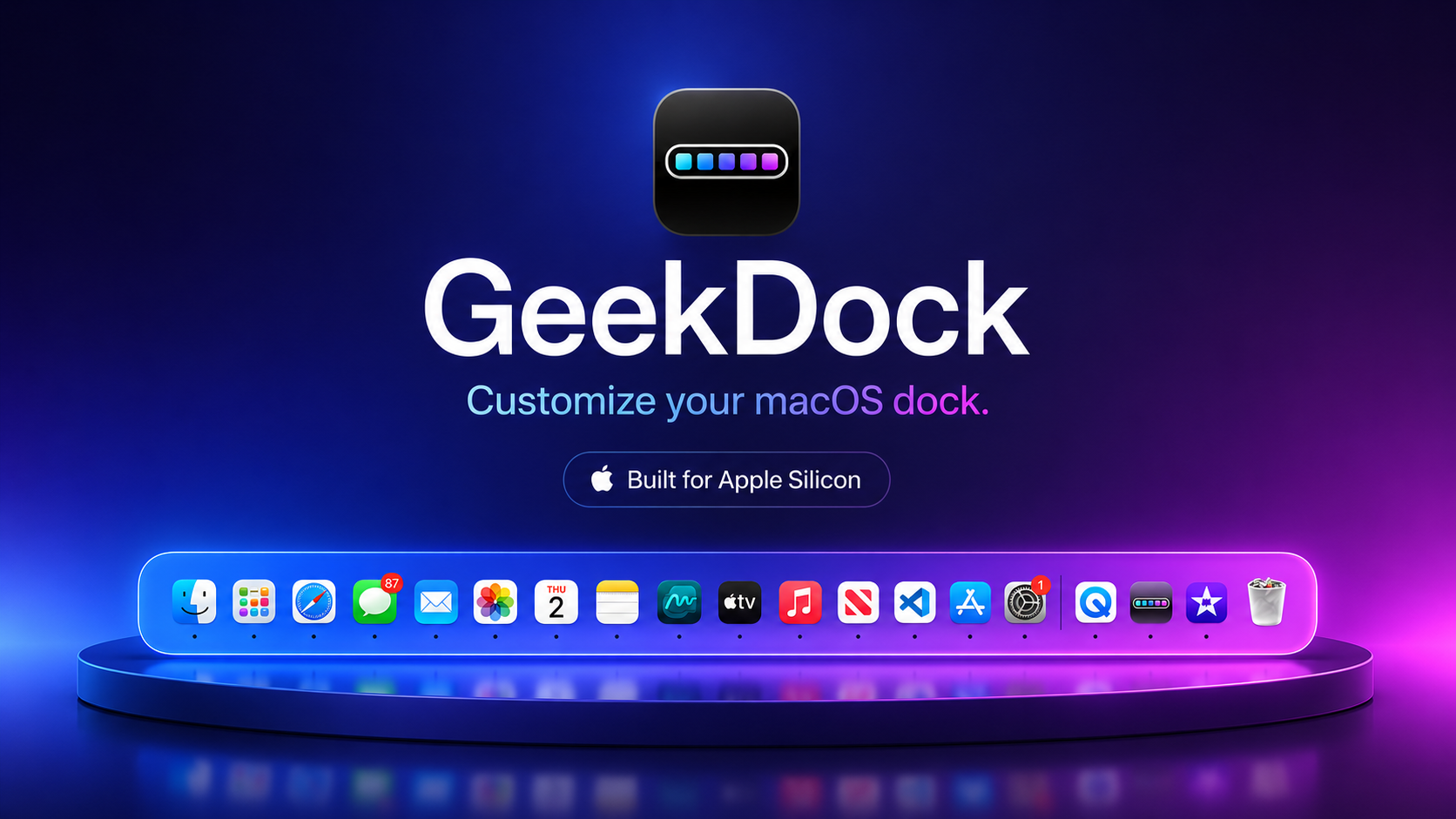
Start by cleaning up unnecessary Dock items
The Dock is useful because it is always nearby. It becomes less useful when it holds every app you have opened in the last year. Before changing colors or icons, remove anything you do not launch regularly.
Right-click an app in the Dock, choose Options, and remove it from the Dock if it does not belong there permanently. You can still open it from Spotlight, Launchpad, Finder, or the Applications folder.
A cleaner Dock is easier to style because each icon has a purpose. It also makes visual customization feel intentional rather than noisy.
Organize frequently used apps
Group the apps you use most by habit. Put daily tools where your hand expects them: browser, calendar, notes, editor, design app, terminal, media app, or communication tools. Keep rarely used utilities out of the Dock.
If you use Spaces or Stage Manager, think about which apps belong to each work mode. A smaller Dock can make mode switching feel calmer because it gives you fewer visual choices at the bottom of the screen.
Use Finder folders or Launchpad for everything else. The Dock should be a launch surface, not a complete inventory.
Adjust Dock size, magnification, position, and hiding
macOS includes useful Dock controls in System Settings. You can change size, turn magnification on or off, move the Dock to the left, bottom, or right edge, and choose whether it hides automatically.
A smaller Dock works well on laptop screens. Magnification can make small icons easier to select, but it can also feel busy. Auto-hide gives you more room, but it adds a tiny delay every time you need the Dock.
Try one change at a time. A Dock that looks good in a screenshot may not feel good after a full day of work.
Choose colors and gradients that fit the wallpaper
Color is where a Mac setup starts to feel personal. A Dock underlay that picks up a color from your wallpaper can make the desktop feel more coherent. A subtle gradient can add depth without pulling attention away from your work.
GeekDock is built for this kind of customization. Its product page describes Dock colors, menu bar colors, Dock gradients, gradient direction, wallpaper matching, and clean icon themes.
Use contrast as your rule. If the wallpaper is bright, the Dock needs enough darkness or saturation to keep icons readable. If the wallpaper is dark, a soft accent can keep the Dock from disappearing.
Customize folder and file icons carefully
Custom folder and file icons can make important locations easier to recognize. A design folder, school folder, client folder, or game folder can have a distinct look without turning Finder into a decoration project.
GeekDock lists folder icons and file icons as things it can change. Use that power for landmarks, not everything. If every folder has a special icon, none of them stand out.
A good rule is to customize the folders you open every day and leave the rest simple.
Create themes for different modes
Different visual themes can support different modes. A work theme might use muted colors and high contrast. A gaming theme can be brighter. A study theme can be calm and low-distraction. A creative theme can lean into color.
GeekDock mentions theme presets on the current site, so you can treat themes as repeatable visual setups rather than one-off experiments.
Some glass-related visual features may require Apple silicon where appropriate. The GeekDock compatibility panel currently lists Apple silicon only, so check the product page before assuming it will run on an Intel Mac.
Avoid making the desktop visually overwhelming
Customization should make the Mac easier to enjoy and navigate. If the Dock, menu bar, wallpaper, icons, widgets, and desktop files all compete for attention, the system starts to feel heavier.
Use one or two strong visual ideas. Match the Dock to the wallpaper. Give key folders clear icons. Keep the menu bar readable. Then stop before the desktop becomes a project of its own.
If you also want to organize project materials, pair visual customization with the guide on organizing your digital workspace on a Mac.
Where GeekDock fits
GeekDock is a focused macOS utility for styling the Dock, menu bar, folders, files, and desktop icons with colors, gradients, and clean themes. It is local and does not read the private content inside your files, according to the product page.
Use it after you have simplified the Dock and decided what kind of visual system you want. The best customization starts with clarity, then adds personality.
Conclusion
A customized Mac should still feel like a usable Mac. Clean up the Dock, organize the apps you actually use, choose readable colors, coordinate the menu bar, and customize only the icons that help you move faster.
When the visual system supports the way you work, your Mac feels more personal without becoming harder to use.
 Related: ScreenShelf
 Related: FocusForm